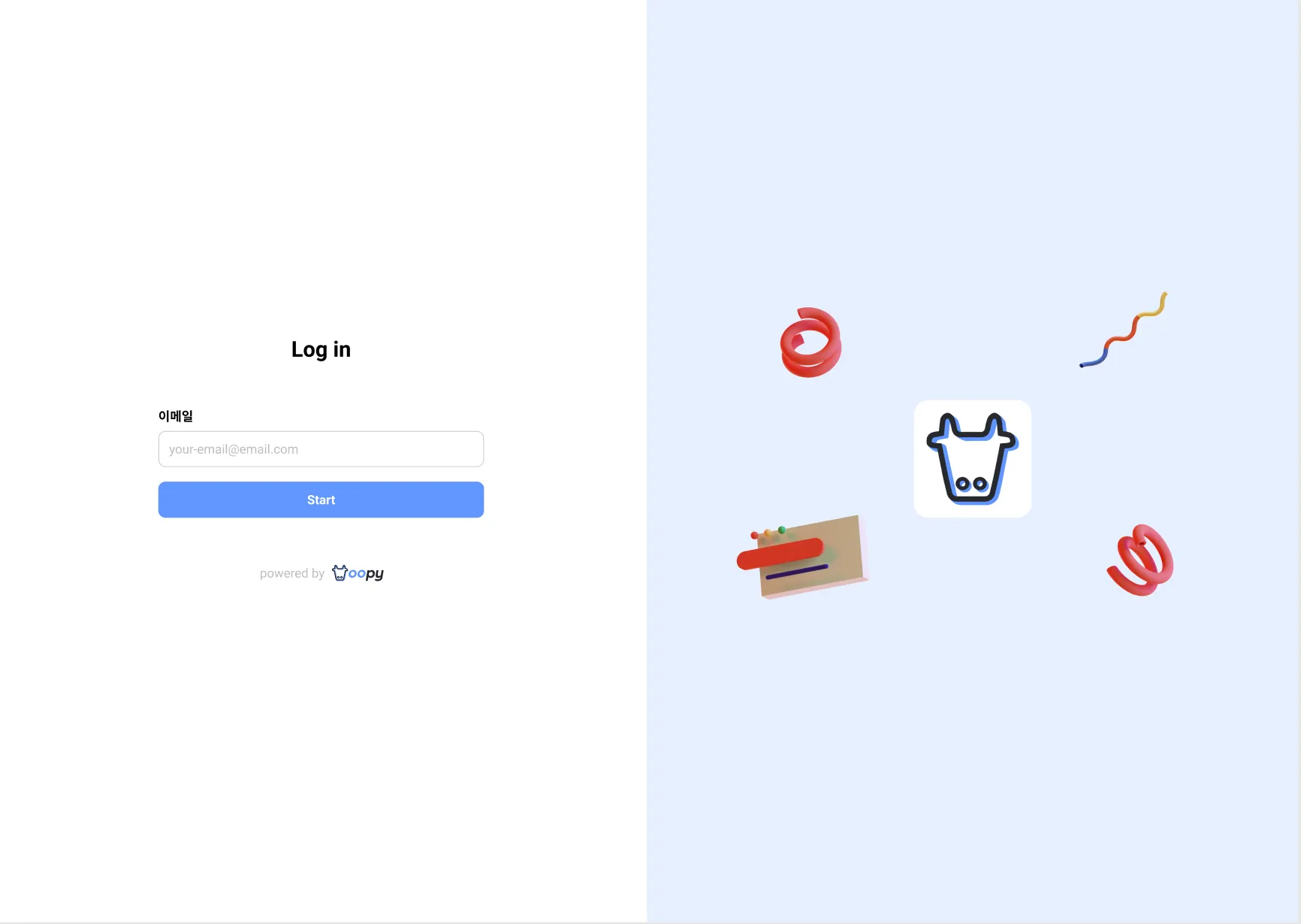
Sign in page
We use the logo and the color for the button and the background of the sign in page.
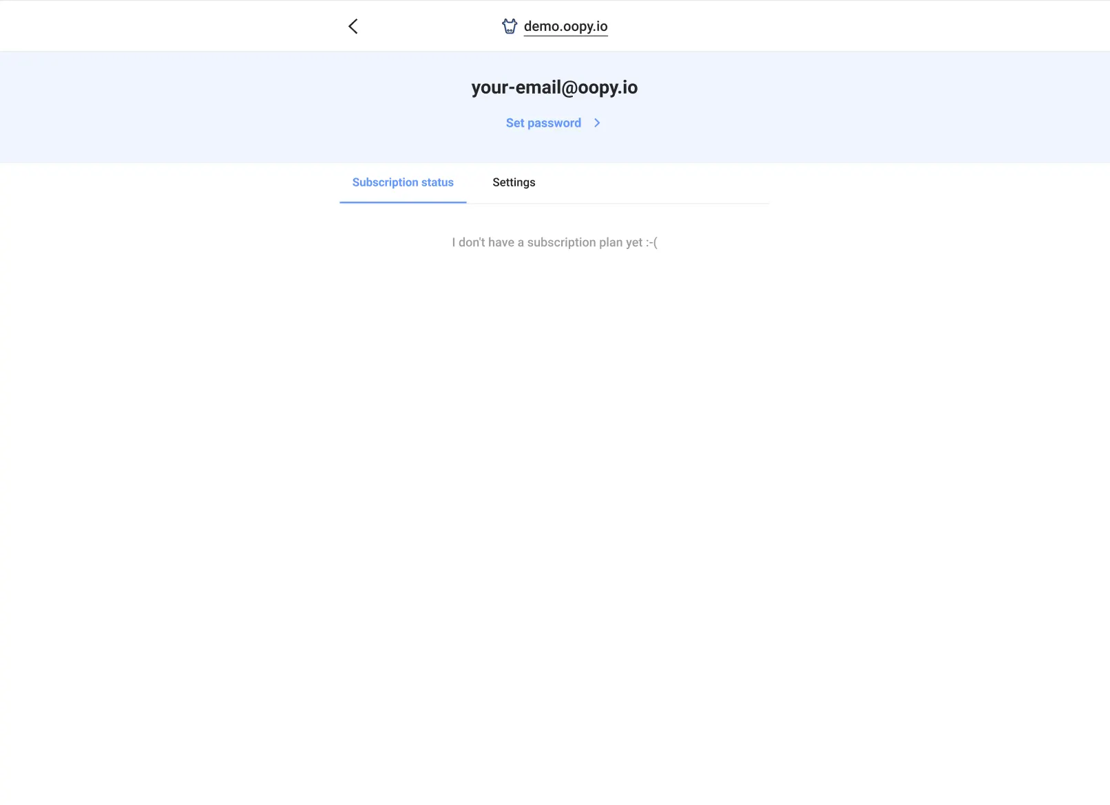
Mypage of a member
We use the color for the background of the area with the email address, text button, and the tab color.
Buy(Subscribe) button
We use the color for the buy(subscribe) button.
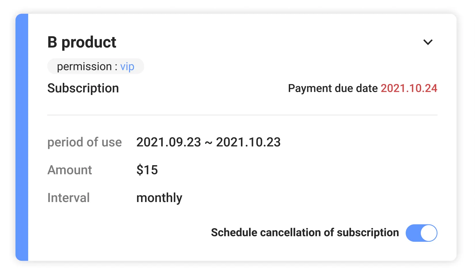
Product card
The color of the band on the left of the product card purchased by the member changes.
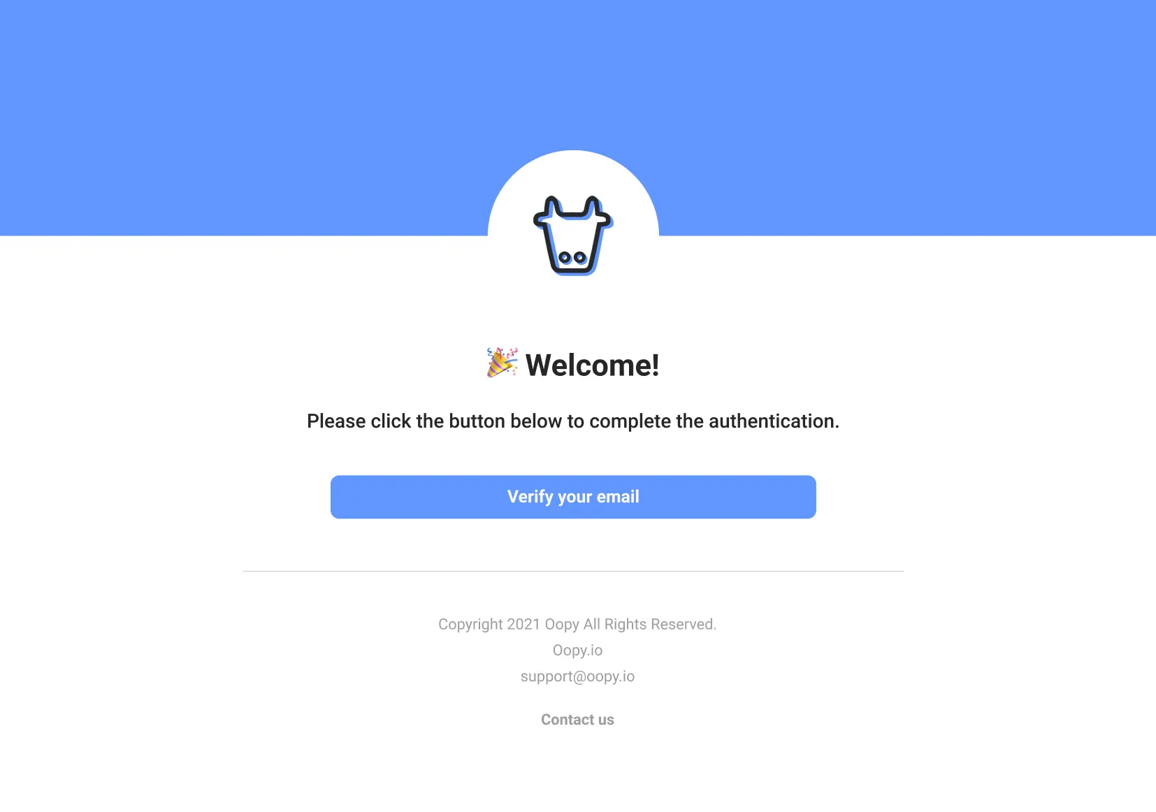
Verification email
We use the color for the background and the button of a verification email.
Tips
•
The text color of all buttons is fixed to white. If the brightness of the brand color is too high, the text may be difficult to see, so be careful!
•
If you don't set logo an color, default option would be used.
◦
Default color is black(#000000)
◦
Default logo is blank


